800-842-0207 | info@fordequity.com Copyright ©
2009, Ford Equity Research, Inc.
Custom Graph Tutorial
Page
EPIC/FirstCall for Windows Upgrade 2
Custom Graphs from EPIC for Windows 4
Custom Graphs from EPICOnline 5
Custom Graphs as a Stand Alone Research Tool 6
Custom Graphs Tool Bar 7
Creating a New Custom Graph 20
Creating a New Custom Graph Tour 31
EPIC/FirstCall for Windows Upgrade
The EPIC/FirstCall for Windows version 3.70 includes drop down menus to allow quick selection of saved Portfolio, View, Screen, Sector and Create Variable functions. In addition the ticker symbol(s) for one stock or a portfolio can be entered in the Tickers box.
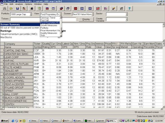
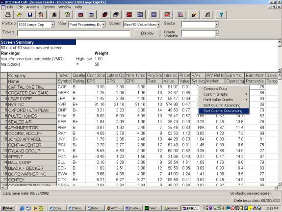
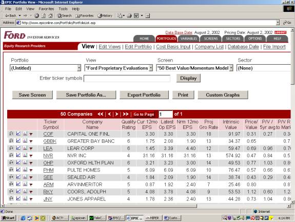
Clicking on a specific cell for a variable, or a stock, and right clicking the mouse will allow you to access all Company Data for the company which cell has been selected, create Custom Graphs, retrieve Ford Value Graphs or Sort Column by the variable that is highlighted. In this case the first cell under Earnings Momentum is highlighted and Sort Column Descending is selected.
Custom Graphs from EPIC for Windows
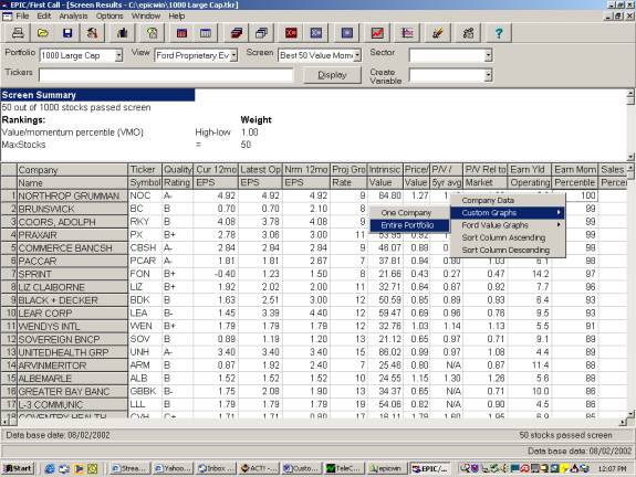
The portfolio has been ranked by Earnings Momentum and by right clicking again, selecting Custom Graphs and Entire Portfolio, default graphs will be created for all stocks in the portfolio.
Custom Graphs from EPICOnline.com
EPICOnline.com also allows you to create custom graphs for a stock or portfolio at the Portfolio Tab, by clicking on the Custom Graph button and selecting Open then OK.
Custom Graphs as a Stand Alone Research Tool
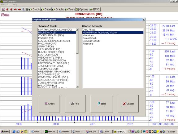
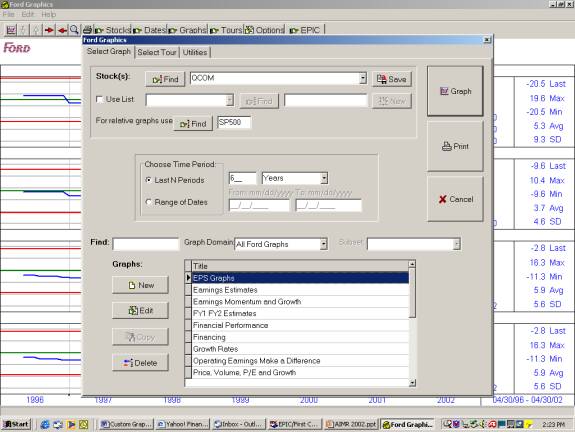
Custom Graphs has been designed to be used as a stand alone research tool and may be initiated by clicking on Start, Programs, and Ford Graphics. The Select Graph dialog appears and tickers may be entered in the Stock(s): entry box with a space between each ticker. You may also search by Ticker, Company Name or CUSIP by clicking on Find. Once the stocks have been entered click on Graph.
Custom Graph Tool Bar
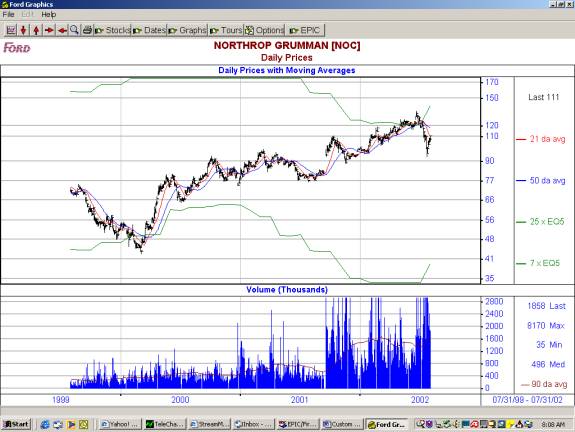
Currently a tour of graphs (group of graphs called the Ford Tour) is being displayed and the first graph is a high, low, close graph with volume, valuation bands and moving averages. The next stock in the portfolio can be retrieved by clicking on the down arrow on the tool bar (or using the down arrow key).
The next graph can be accessed by using the right arrow on the tool bar (or by using the right arrow key).
The magnifying glass on the tool bar shows all stocks in the portfolio and all graphs that are available under the currently selected Ford Tour. Any stock and any graph may be selected by highlighting them, and graphed by clicking on the Graph button or printed by clicking on the Print button.
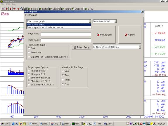
The print button on the tool bar allows you to print out the current graph or print out a whole portfolio or tour. Under Print current graph a Page Title: can be entered that will appear at the top of the graph and a Page Footer: can be entered for the bottom of the graph. Under Print/Export Type: the graph can be printed by checking Print, exported to a file by checking Print to File, or printed as a post script file and Adobe Distiller can convert it to a PDF file by checking Export to PDF. The Page Layout Options and Max Graphs Per Page allow you to change from portrait (7X9) to landscape (9X7) and also print 2, 3 and four graphs in each layout.
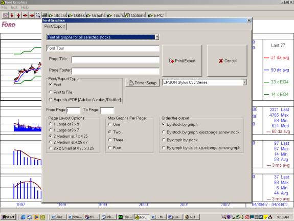
Selecting Print all graphs for all selected stocks adds additional options under Order the output with the selection of:
By stock by Graph, allows every graph on a tour for one stock, immediately followed by next stock.
By stock by graph,
eject a page at new stock allows every graph on tour for one stock, with
the next stock starting at a new page.
By graph by stock, allows every stock in a portfolio for one graph, immediately followed every stock for the next graph.
By graph by stock, eject page at new graph, allows every stock in a portfolio for one graph, with the graph stock starting at a new page.
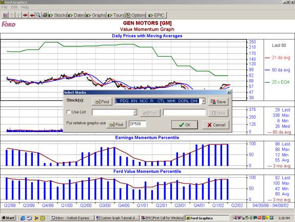
To graph a new stock without returning to the EPIC View, click on Stocks on the tool bar, click in the Stocks(s): entry box which lists the tickers in our last portfolio, type in a new ticker and click on OK or hit Enter and the new graph will display.
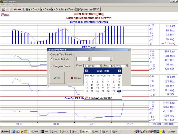
To change the time frame of the graph, click on Dates, and across from Last N Periods highlight and change (or down arrow) the number of years and click OK. Periods can also be changed by using the down arrow.

Specific starting and ending dates can also be selected by clicking on Range of Dates and entering the starting and ending dates with a mm/dd/yyyy format, or clicking on the down arrow, selecting the month and click on the day, then click OK.
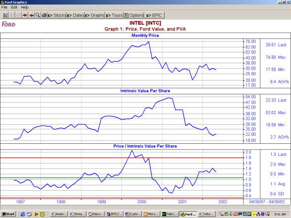
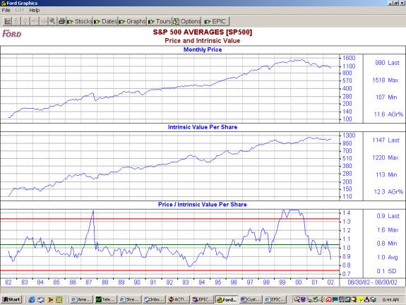
To change to other saved graphs that are not in the Ford Tour, click on Graphs on the tool bar, arrow down and select All User Graphs and click on OK. Then select the graph titled Price and Intrinsic Value and click on OK. Then go to Stocks on the tool bar and put in SP500 which is the ticker symbol for the S&P500 and to Dates and change time frame 20 years.

The Monthly Price, Intrinsic Value Per Share and Price/Intrinsic Value Ratio shows. The green line is the average for the period selected and the red lines are 2 standard deviations of the mean.
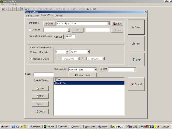
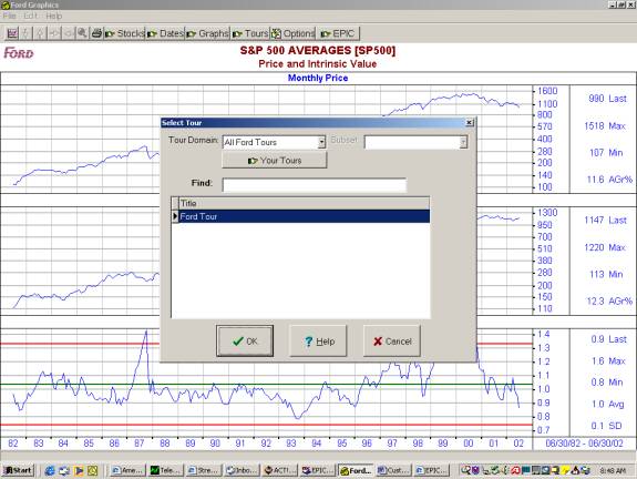
Tours are groups of graphs that can be scanned through by using the right and left arrows on the tool bar (or left and right arrow keys). To access saved tours go to Tours on the tool bar and select the Ford Tour.
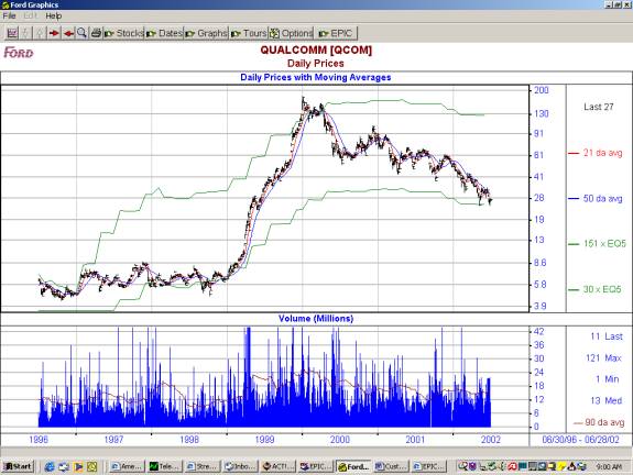
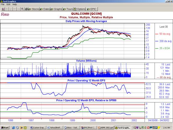
The daily pricing in Custom Graphs is only available for six and a half years so the first graph of our tour, Daily Prices will need to be shortened (or switched to monthly prices which go back to 1970), so select 6 years and change the stock to Qualcom symbol QCOM.
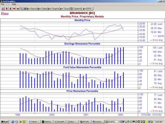
Now the right and left arrows can be used to go between the Daily Prices, Earnings Growth, Financing, Monthly Price Proprietary Models, Sales Growth and Valuations graphs.
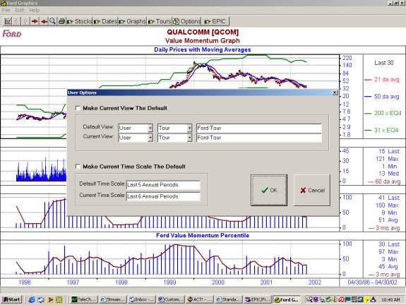
The default view, which will show each time Custom Graphs are selected, can be changed by selecting any graph or tour with the format desired, clicking on Options on the tool bar, click on Make Current View The Default and selecting OK. In this case the Ford Tour will come up each time a graph is requested.
A default time scale can also be set by selecting the desired time frame in the current view and then clicking on Make Current Time Scale The Default.
The last button on the tool bar EPIC takes you back to the EPIC program.
Creating a New Custom Graph
To create a new graph click on the first button on the tool bar, then the Select Graph tab. This tab allows many of the functions that are available on the tool bar such as changing tickers in Stock(s): or changing the time frame in Choosing Time Period.
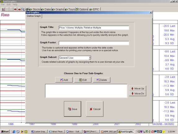
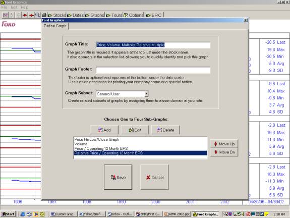
In addition new graphs can be created and existing graphs can be edited or deleted. To create a new graph select the New button in the bottom left under Graphs:
Enter a title that will appear at the top of the graph and you can also enter an optional footer.
Next select the Add button and you can choose up to four graphs.
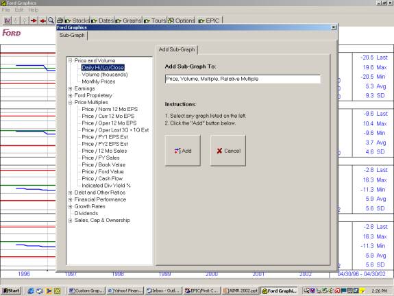
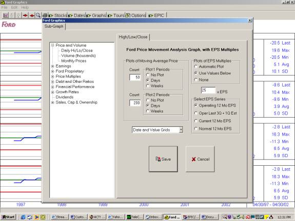
Click on the any of the nine major categories of data to see the individual choices for graphing. First click on Daily Hi/Lo/Close and select Add.
It now shows the High/Low/Close options. Two moving averages may be plotted by entering the number in the Count box and then select the periods to use in the Plot 1 Periods and Plot 2 Periods. We have entered a 50 day and a 200 day here.
Next EPS multiples can be plotted either by selecting Automatic Plot which uses the 95th and 5th percentile average P/E for the time period selected for the graph multiplied by the earnings series selected under Select EPS Series. Use Values Below allows entering a specific multiple and in this case we have entered 25 xEPS and selected Operating 12 Mo EPS which is the same value as on the S&P500 chart earlier.
Grid lines can also be altered by clicking on Date and Value Grids and selecting one of the other choices.
Now select Save and the Price/Hi/Low/Close Graphs will appear as the first of 4 sub graphs.
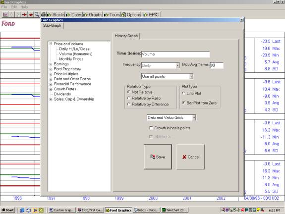
Now select Add, Volume and Add again to add Volume to the graph. A Moving Average can be added, in this case 90 days, and the volume will be a Bar Plot from Zero.
Click on Save and Volume will appear as the second sub graph.
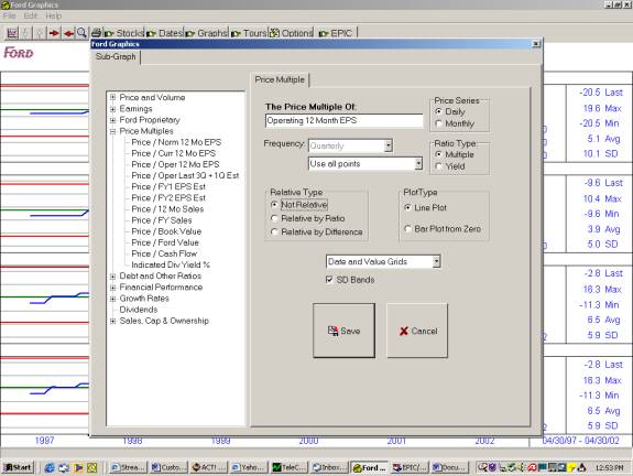
Select Add again, Price Multiples, P/Oper 12 Mo EPS and Add Again. Note that the Price Series can be changed from Daily to Monthly, the Ratio Type can be a Multiple of price to earnings or a Yield of earnings to price, the Plot Type can be a Line Plot or a Bar Plot from Zero and the Relative Type can be changed which will occur in the next graph, and the Standard Deviation Bands can be turned off or on. Click on Save and Price to 12 Month Operating EPS will appear as the third Sub-Graph.
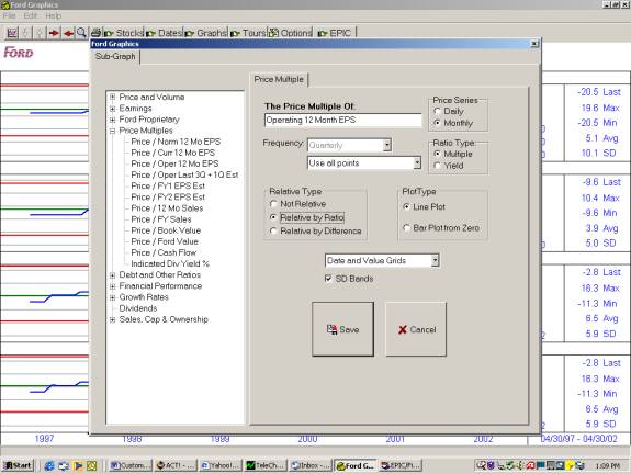
Select Add again, Price Multiples, P/Oper 12 Mo EPS and Add Again, only this time make it Relative by Ratio, then Save.
The Define Graph should list our four sub-graphs, then click on the final Save, and then Graph.
The result shows a daily price graph of Qualcom, with moving averages and a 25 times operating earnings line. Daily volume is also shown as well as a 90 day moving average line. The Price/Operating 12 Month EPS lines ends at 35.5 and the Relative to SP500 ends at 1.5 indicating the 35.5 is 50% higher than the multiple on the S&P500.
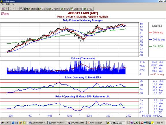
If you want to compare Abbott Labs to Johnson and Johnson go
to Stocks and enter abt as the Stock(s): and jnj as For relative graph use:
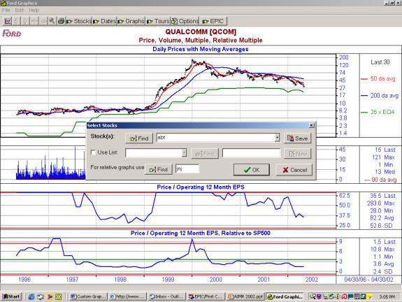
Any stock symbol or exchange symbol in the database such as SP500, MC400, SC600, F1000 can be used for For relative graph use:.
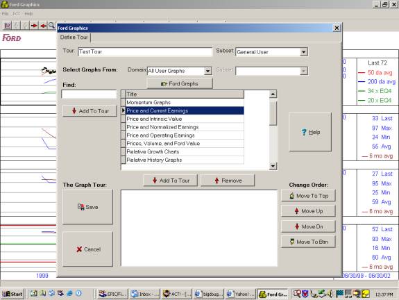
Creating a Custom Graph Tour
By selecting the graph icon at the left of the tool bar and the Select Tour tab the Stock(s): to graph in the tour may be changed, the stocks used for relative graph use may be changed, and the time period may be changed as they can be on the tool bar. In addition tours can be created and edited by clicking on the New and Edit boxes under Graph Tours: in the lower left hand corner.
Click on New and the Define Tour tab will appear and under Tour: type in a title for the tour in this case Test Tour. Graphs may be stored in several different domains so under Select Graphs From: Domain select All User Graphs. Several example graphs are stored here and you are free to edit or delete them. The first graph available is Momentum Graphs is highlighted. Click Add to Tour and Momentum Graphs will appear as the first graph in the tour. Do the same with the next several graphs of your choice and then select Save. Enter the symbol INTC and SP500 for relative graph use and select Graph.
By using the right arrow the other graphs in the tour may be accessed.